Sedley Place originally designed the packaging and graphics for Johnnie Walker Blue Label in 1988. Originally called Johnnie Walker’s Oldest – as the product was a blend of 60 year-old whiskies – Blue Label was created to elevate Johnnie Walker to a premium not a commodity brand positioning. Our design of the bottle, based on Victorian blue glass bottles, was an attempt to recreate history and allow the consumer to be transported back in time. So when we were briefed 20 years later to develop the brand we were especially mindful of the brand’s equity. Our resulting idea was to create thicker and deeper cobalt blue glass, to give the brand even more presence and authority in the hand while retaining its 70cl volume and distinctive shape.
AWARDS
Silver DBA Design Effectiveness Award 2014
Bronze Cannes Lions Award 2012
Sedley Place has produced a base reel of content for Diageo to be used on LED screens within the company’s main atrium, bar and meeting hub at its headquarters in Park Royal. The reel acts as a visual extension of the Diageo brands and the ambient content complements the building’s interior environments.
The agency has developed a series of content that uses borescopic camera technology to capture flowing liquids at a detail far greater than macro and at an increased frame rate of 120 frames per second, allowing for extreme close-ups which move at a super slow speed. The results are elegant and abstract footage of gin, lager and whisky, with further content to be rolled out later in the year.
AWARDS
Nomination Drum Design Awards 2015
Galloping Gourmet, the specialist wedding event planners, managers and caterers, has recently launched its new brand identity, which was designed by us following an extensive strategic review and brand re-definition exercise.
Working closely with Galloping Gourmet’s Senior Management Team and the design team at Country House Wedding Venues (CHWV), the company’s sister organisation, we spent considerable time understanding the brand’s history, core proposition, target markets, customer journeys and mind-sets, competitors and brand touch-points before putting pen to paper and creating a new brand identity. Within this process we also held a workshop with staff from a number of the company’s venues and conducted telephone interviews with a sample of past clients.
The new brand is now being rolled out across Galloping Gourmet’s marketing collateral by the CHWV Design Team and us, using specially created brand implementation guidelines. As part of this exercise we’ve designed its 2017 Menu, created a new piece of literature, a Promise Brochure, which encapsulates the brand’s client-centric philosophy, and will shortly launch its redesigned website. All of these elements carry our new strapline ‘Your Dream Wedding Partner’.
The whole project has been characterised by a close and highly productive relationship. In the words of Simon Robson, Galloping Gourmet’s Founder, “We engaged Sedley Place to provide its independent view of our business and then re-imagine what was required to support our continuing development. The team employed a great deal of energy and expertise getting to know our people, product and audience. This then informed an impressive step-by-step creative process reviewing everything from our logo and accompanying strap-lines through to our menus, literature, tone of voice and (the current work in progress) our website and social media development. It’s been a tremendous and good-spirited partnership and one which continues to impress”.
HOLDING ONTO THE BABY - A PREMIUM BRAND REFRESHED
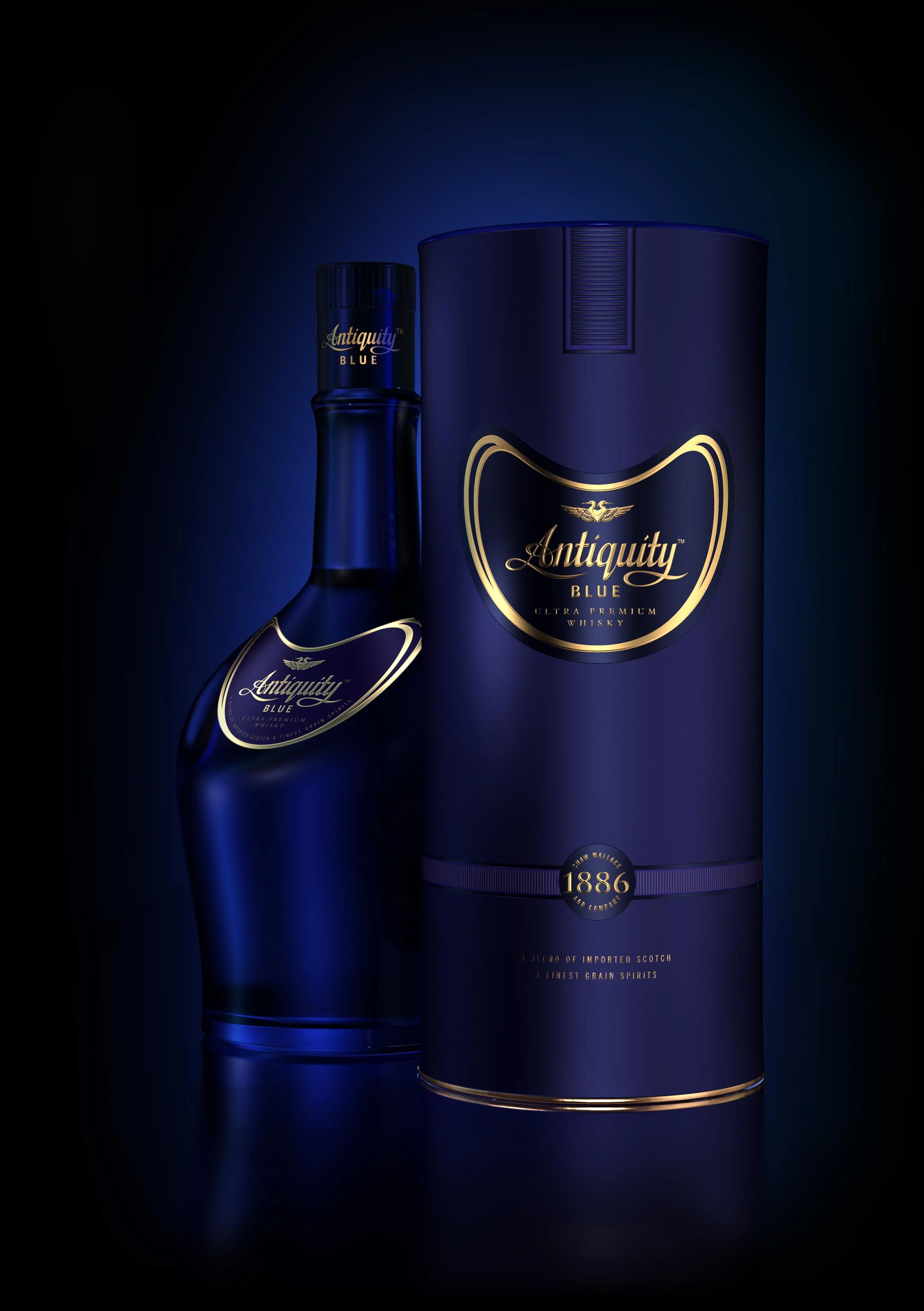
2017 saw the re-launch of Diageo India’s Antiquity Blue whisky brand in India, following a design refreshment and internationalisation exercise by Sedley Place. The brand is well established in the Premium sector of the market, having been initially launched in 2005, and has a strong brand profile amongst whisky lovers and aficionados, partly due to its very distinctive asymmetrical bottle shape. It’s currently one of the fastest growing Indian whisky brands, year on year.
Our brief primarily was to premiumise the look of the bottle graphics, capsule and carton but the project also included an initial appraisal of the bottle shape and colour, and an assessment of whether these two should be developed in any way. Ultimately it was decided that so much equity resided in the existing shape and colour that they should be retained.
One of the challenges of the refreshment project was to understand which of the features of the brand identity and packaging, above and beyond the bottle, represented core brand assets and which features should be refined or developed. Another challenge was to create a new ownable and distinctive brand asset which could exist on the new packaging but also be used in promotional situations. Although the brand had a number of core assets the Brand Team wanted to add a new asset which would reinforce the brand’s premium cues and contribute to the brand story.
Our work encompassed four areas. We refreshed the brand marque to ensure that it reflected the brand’s ‘contemporary’ personality trait. In doing this we also looked at the style and relationship of ‘Antiquity’ and ‘Blue’. We refined the layout and shape of the main label to de-clutter it and emphasise the ‘ultra premium’ message. Taking our inspiration from the Ancient Egyptians, the first manufacturers of glass, we created a new double-headed heron icon. The icon not only celebrates Antiquity Blue’s innovative glass bottle but signals a brand acknowledging its past and looking forward to the future. Lastly, we redesigned the carton to imbue it with more sophistication. This was done through the design itself, the use of foiling and embossing, and the soft-touch finish to the materials it is constructed of.
In the words of Subroto Geed, Senior VP-Marketing at Diageo India, “Antiquity Blue stands for the timeless art of whisky making and the new pack showcases that beautifully. This brand renovation transitions the brand into a more contemporary and modernised territory that speaks to true whisky connoisseurs. We are very happy to see that the consumers are already appreciating this finer experience”.