
Glen Moray is a significant player in the single malt whisky category and in the Speyside whisky segment in particular. In certain global markets it features in the top five malts by volume.
Although it has witnessed increased sales over the last couple of years its owners, La Martiniquaise-Bardinet, had identified through consumer research that its packaging was underperforming across a number of factors, such as modernity, quality perceptions and on-shelf presence. Its brand team was also keen to ensure Glen Moray’s cask expertise continued to be properly communicated and that its core pack and range variants were clearly identified.
Core Assets
The Glen Moray’s brand has a number of key visual assets, which consumers recognise and relate to, and we were very mindful of these when we were tasked with redesigning the packaging - in particular the gift carton, bottle labels and capsule.
“With any project of this sort, where the goal is to attract new consumers while retaining existing ones, it’s vital that you’re respectful of a brand’s core assets. Otherwise, you could end up throwing the baby out with the bathwater. In Glen Moray’s case these assets communicated authority, provenance and history so were especially important”, says Giles Calver, Sedley Place’s Planning Director.
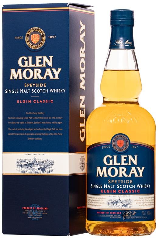
Old packaging

New packaging
Wordmarque and Crest
The existing wordmarque was developed to invest it with more personality and uniqueness, while the brand’s crest was simplified, modernised and given greater prominence on pack. In the latter’s case we also incorp-orated the meaning of the crest’s four integral devices (ingredients, maturation, flavour and shipping) into the brand story on the gift carton.

New Blue & Angled Graphic
Having reviewed the packaging in a range of off-trade outlets we brightened its blue to give it more presence, especially in stores with poor lighting. In addition, we introduced a new angled graphic feature, which asymmetrically splits the pack’s core blue and white colours, to give the packaging more on-shelf impact.
Distillery Illustration
With consumers keen to engage with brands with an authentic heritage we had the distillery illustration redrawn to more accurately reflect the building’s distinctive features, and this element, along with the founding date and the distillery’s Speyside location, contributes to the projection of Glen Moray’s history and provenance.

Name Change
Glen Moray’s Explorer Range comprises its Classic whisky and five cask finishes showcasing the brand’s maturation and finishing expertise, and our redesign incorporated a name change for its core whisky from the Elgin Classic to Our Classic. The new name was given due prominence on the new packaging.
Core & Cask Variants
We were also aware that our new design needed to work for both the brand’s core whisky and its cask variants and all six whiskies in the Explorer Range now feature the new design, with names, cask illustrations and colour changes identifying the five individual cask finishes.

See video for the Glen Moray story: https://www.youtube.com/watch?v=r8zmSCAai1k
New packaging images courtesy of La Martiniquaise-Bardinet. Glen Moray video created by Blazon.
Copyright remains with the image’s owner.